set.a.light
As part of the UX team, I co-designed the interface screens and developed interactive prototypes for the Bosch Kiox 300, a cutting-edge display for e-bikes. Working closely with real users throughout the design process, we created intuitive interactions and a clear visual language that support riders in every situation. The Kiox 300 offers detailed performance data, navigation, and fitness tracking, enhancing every ride with smart connectivity. Seeing it now on the market, empowering thousands of cyclists, makes this project a true milestone in my design journey.
STRATEGY
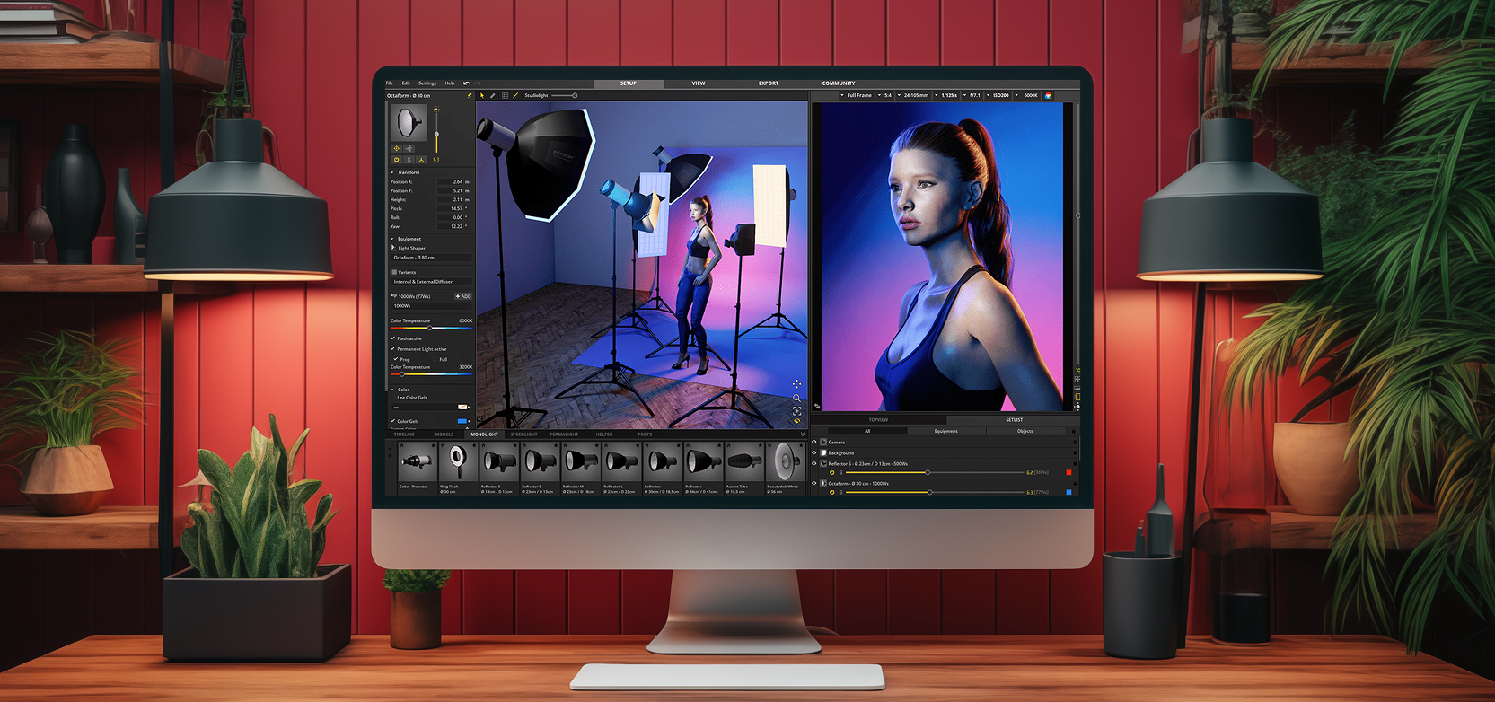
set.a.light 3D’s redesign set out to evolve the tool from a niche simulator into an everyday companion for photographers of every skill level. Together with elixxier GmbH we defined business goals to lift trial conversions, shorten the path to a first successful scene, and raise ongoing engagement. Success would be measured through smoother onboarding, clearer feature discovery, and a fresh visual language that radiates professional quality.
RESEARCH INSIGHTS
I began with an analytics deep-dive, remote think-aloud sessions, a competitive teardown, and a usability audit. Two patterns stood out:
- Newcomers got lost in a dense, flat navigation and unfamiliar jargon.
- Experts found advanced modifiers—but only after long, repetitive searches.
Both groups asked for a clearer mental model of where they were in the software at any moment. Early card-sorting and sitemap tests confirmed that a re-worked information architecture, rather than extra features, would deliver the biggest usability gain.

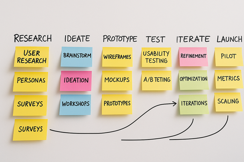
APPROACH
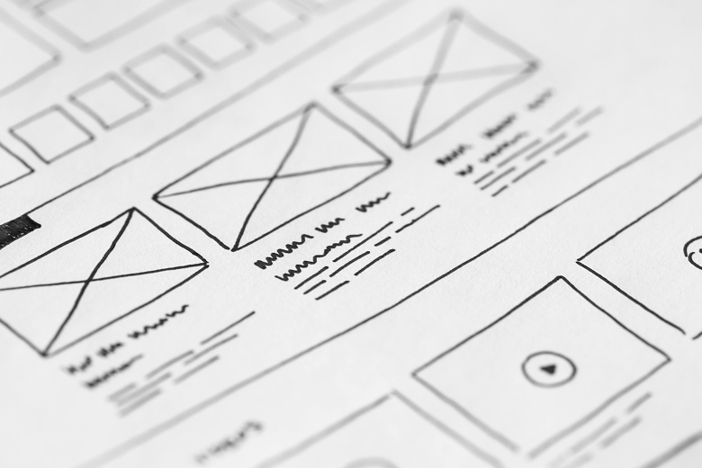
Following a Design-Thinking loop, I mapped the insights into opportunity themes, then ran rapid design sprints to explore solutions. Low-fi wireflows and click-through IA prototypes let me validate new hierarchies in days, not weeks. Weekly design-dev syncs and a shared design-token library kept hand-offs crisp and ensured the chosen patterns were technically feasible.
DESIGN
The released experience centres on a re-structured, four-level navigation model that groups tasks by intent (Plan • Build • Refine • Output). Progressive-disclosure drawers replace sprawling toolbars, showing only context-relevant controls. Interaction patterns are standardised into clear, repeatable gestures—drag-in, click-to-edit, press-hold for alternates—so users know exactly how to interact, no matter the object.
To cut cognitive load even further, I redesigned the entire library logic: assets are now organised by shoot context (scenario → light → modifier) instead of raw file type, while smart filters surface the most probable choices first. Together, these changes flatten the learning curve, reduce unnecessary clicks, and keep the workspace visually calm.
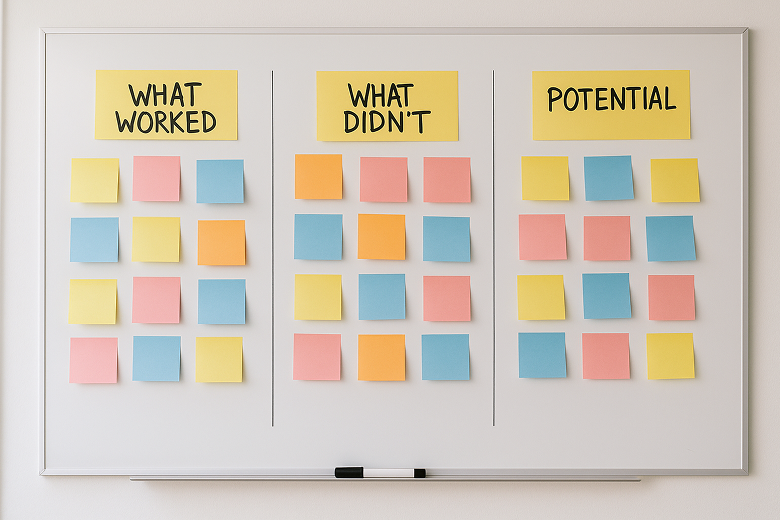
LEARNINGS
Post-launch analytics showed higher conversion, fewer “where do I…?” support tickets, and increased weekly engagement. The project proved that information architecture and interaction logic often unlock more value than adding brand-new features. It also highlighted the power of a shared design-token system: once core patterns were codified, updates rolled out smoothly across screens. A possible next step could be opening the new navigation model to community feedback, ensuring it scales with future toolsets while staying intuitive for first-time users.